Use traqqer Statistics to See Training-Category Distribution and Frequent Workouts
Updated July 15, 2026
By the traqqer Editorial Team
Daily training makes it surprisingly difficult to recognize which work dominates the plan. traqqer’s statistics visualize both category distribution and the menus you use most often.
See Category Distribution as a Donut Chart
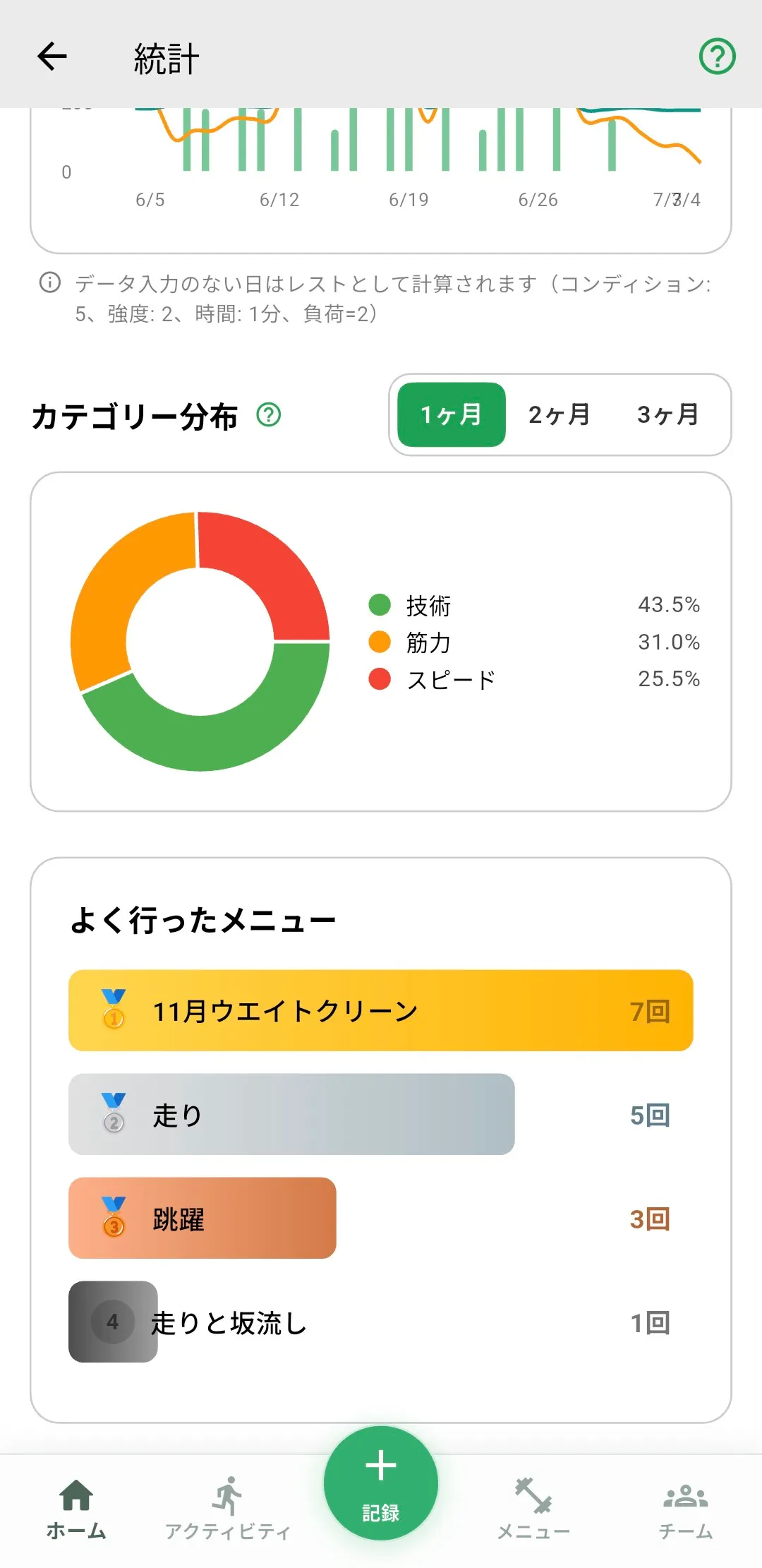
Workout menus can be labeled as speed, endurance, strength, technique, recovery, or other. Statistics display those categories as a donut chart. See how the categories work.
The chart makes a speed-heavy block, a lack of technique work, or another imbalance visible without reading every number.

Imbalance Can Be Useful or Accidental
A winter block may intentionally favor endurance, while pre-competition training may shift toward speed and technique. The chart is not asking every category to be equal. It helps you identify a pattern that does not match your intent.
Review the Most Frequent Menus
A second view ranks workouts by how often they were completed. This can reveal that a menu you believed was common is rare, or that the same comfortable session has been repeated by habit.
Let the Visualization Prompt a Decision
Use the category chart to examine content and workload statistics to examine quantity. Together, they provide a fuller view than either alone. The statistics improve as more training records accumulate.
Start Your Journey with traqqer
traqqer is an AI-powered app that helps you build better habits.
Download now and transform your daily routines for a better life.
